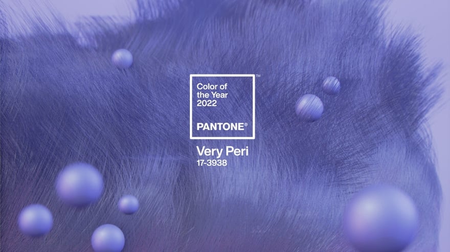
Pantone recently announced PANTONE 17-3938, Very Peri, as the 2022 color of the year. The tone is described by the color authority as “a dynamic periwinkle blue hue with a vivifying violet red undertone.” Pantone created this color instead of selecting from their existing arsenal, as they have done in years past, in order to project a spirit of inventiveness. Pantone Color Institute vice president Laurie Pressman remarks that Very Peri “really moves seamlessly between physical and digital,” being as well suited for a designer dress as it is for a custom Zoom background.
Bridging the gap between the physical and the digital is no small feat. Pantone is investing heavily in associating Very Peri with the digital world. In their favor, however, is the existing affinity for this hue in popular physical paintings being traded on the Contemporary art market.
In its messaging and partnerships, Pantone draws a connection between their latest hue and the digital realm, capitalizing on the current cultural interest in the metaverse. Pantone will infuse the world of working from home with a splash of Very Peri in partnership with Microsoft, creating custom Teams backgrounds, Powerpoint templates, and more.
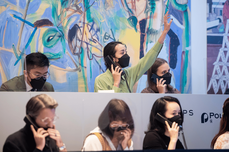
Very Peri will also be tied to the specific realm of digital art through two additional partnerships. Alongside experiential art company ARTECHOUSE, Pantone will be collaborating to build an immersive digital exhibition based upon the periwinkle hue. The exhibition, located in New York’s Chelsea Market, will construct a sensory experience rich with visuals, textures, and sounds centered around Very Peri and the innovation Pantone feels it represents. In the crypto-sphere, Pantone will be collaborating with digital artist Polygon1993 and blockchain network Tezos to create a series of digital artworks inspired by the color.
While Very Peri may not have had a name yet, its periwinkle hue has already been trending on the contemporary art market, indicating the color’s power and popularity independent of Pantone’s desired digital connotations. 2021 saw enormous market demand for contemporary African figuration, with Kwesi Botchway’s auction debut at seven times the low estimate, Otis Kwame Kye Quaicoe’s solo exhibition at the Rubell Museum as their Artist-in-Residence, and Amoako Boafo’s auction record of $3.4 million at Christie’s Hong Kong. Each of these trending Ghanaian painters are known for their innovative use of rich colors, including shades of periwinkle.
Botchway’s sitter in Burgundy Scarf, 2020, looks out from a purple backdrop, locking in the viewer with her direct gaze. The work resembles a royal portrait; Botchway has noted the royal connotations of the color purple and his use of the color to imbues his figures with a sense of regalness. Otis Kwame Kye Quaicoe similarly sets his figures against a periwinkle background in his 2021 painting Davonni & Xavier. In his large-scale portraits, Quaicoe uses color to explore identity, self, and culture in the context of race. His use of purple reinforces its significance as a particularly expressive and meaningful color.
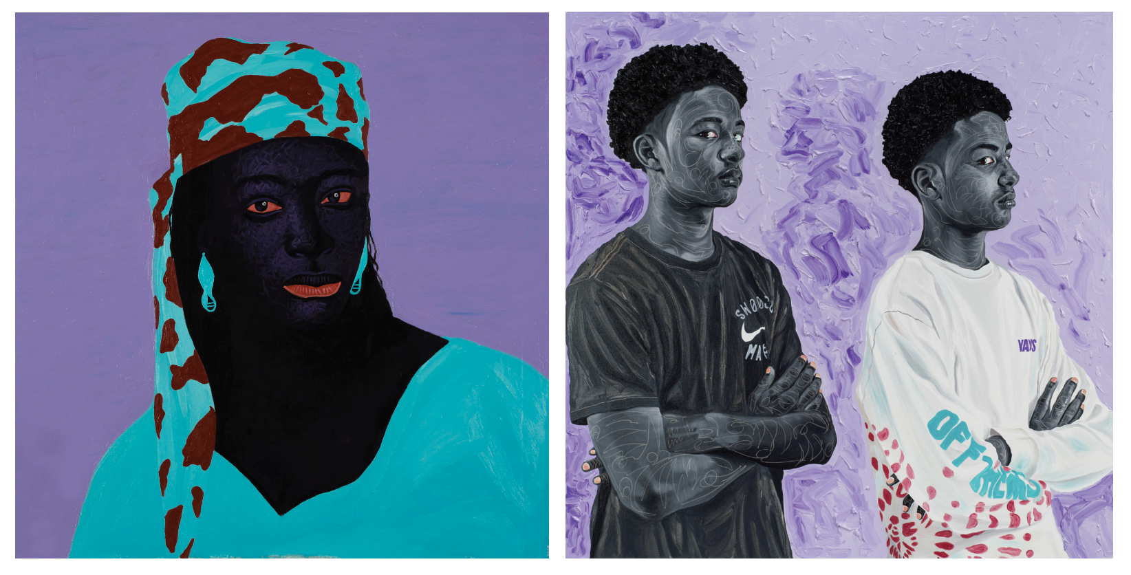 Kwesi Botchway, Burgundy Scarf, 2020 // Otis Kwame Kye Quaicoe, Davonni & Xavier, 2021
Like his peers Botchway and Quaicoe, Boafo’s portraits set powerfully posed figures against flattened grounds. In Purple Shadow, 2021, the artist uses three shades of purple to construct the environment of his figure. Boafo’s concentric shades of periwinkle frame the figure, drawing attention to his authoritative pose. The viewing experience and the narrative of the man depicted are shaped by the purple environment that he inhabits.
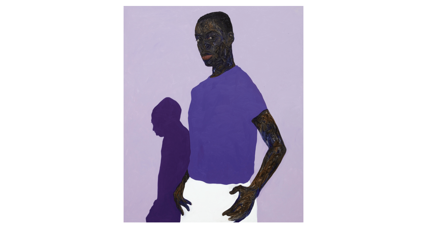 Amoako Boafo, Purple Shadow, 2021
While Very Peri appears in the works of other artists this year, the market clamor for the works of these Ghanaian artists and their affinity for the hue is a clear indicator of the color’s existing popularity. Pantone need not reach for the digital to find appreciation for Very Peri.